
Versatile Design System
Built for Impact
Versatile Design System
Built for Impact
One powerful foundation, four distinct themes, infinite possibilities. Versa UI helps teams design faster, scale smarter, and adapt to any product style — without compromise.
One powerful foundation, four distinct themes, infinite possibilities. Versa UI helps teams design faster, scale smarter, and adapt to any product style — without compromise.


Versatile Design System
Built for Impact
One powerful foundation, four distinct themes, infinite possibilities. Versa UI helps teams design faster, scale smarter, and adapt to any product style — without compromise.
4 Themes × 2 Modes
4 Themes × 2 Modes
Effortless style switching
Effortless style switching
Effortless style switching
Versa comes with four meticulously crafted themes each built on a shared foundation, yet visually distinct. Paired with light and dark modes, you can test and apply radically different aesthetics with a single switch.
Versa comes with four meticulously crafted themes each built on a shared foundation, yet visually distinct. Paired with light and dark modes, you can test and apply radically different aesthetics with a single switch.
4 Distinct Themes
4 Distinct Themes
From refined to bold, choose from Core, Glassmorphism, Neo Brutalism, and Elegant styles.
From refined to bold, choose from Core, Glassmorphism, Neo Brutalism, and Elegant styles.
Light & Dark Modes
Light & Dark Modes
Each theme includes seamless light and dark variations, all fully tokenized for instant switching.
Each theme includes seamless light and dark variations, all fully tokenized for instant switching.
Auto-Adaptive Styling
Auto-Adaptive Styling
Corner radius, shadows, icon weights, and colors adjust automatically based on the selected theme and mode.
Corner radius, shadows, icon weights, and colors adjust automatically based on the selected theme and mode.
Built with Variables
Built with Variables
All theme and mode logic is powered by Figma variables — making global changes effortless and consistent.
All theme and mode logic is powered by Figma variables — making global changes effortless and consistent.
Component Library
Component Library
From Basics to Brilliance
From Basics to Brilliance
From Basics to Brilliance
Versa UI includes an extensive collection of components — from essentials to advanced. Every component is structured with scalable variants, smart nesting, and theme-awareness for seamless use across all design contexts.
Versa UI includes an extensive collection of components — from essentials to advanced. Every component is structured with scalable variants, smart nesting, and theme-awareness for seamless use across all design contexts.
Theme-Responsive Variants
All components respond to theme switches — adapting corner radius, shadow, color, typography, and icon style automatically.
All components respond to theme switches — adapting corner radius, shadow, color, typography, and icon style automatically.
Extensive State & Size Support
Components come with all the interaction states — with support for small, medium, and large sizes.
Components come with all the interaction states — with support for small, medium, and large sizes.
Modular Yet Cohesive
Built using atomic principles — deeply nested but easily overrideable. Update one token, and the system scales.
Built using atomic principles — deeply nested but easily overrideable. Update one token, and the system scales.
Beyond Basics
Includes high-utility product components like chat modules, tables, step indicators, charts, task cards, and more.
Includes high-utility product components like chat modules, tables, step indicators, charts, task cards, and more.
Style Tokens
Style Tokens
Tokens That Do Heavy Lifting
Tokens That Do Heavy Lifting
Tokens That Do Heavy Lifting
Versa’s style foundation is deeply tokenized. Mode and theme variables control everything — from background colors and text styles to shadows and border radius.
Versa’s style foundation is deeply tokenized. Mode and theme variables control everything — from background colors and text styles to shadows and border radius.
Mode & Theme Separation
Variables are cleanly divided into Mode tokens for light/dark mode control and Theme tokens for visual styles.
Variables are cleanly divided into Mode tokens for light/dark mode control and Theme tokens for visual styles.
Color System That Adapts
Includes primitive palettes and semantic mappings with accessibility-checked contrast values.
Includes primitive palettes and semantic mappings with accessibility-checked contrast values.
Flexible Typography Tokens
Typographic system is defined via tokens and linked to text styles, allowing instant font and style updates across all themes.
Typographic system is defined via tokens and linked to text styles, allowing instant font and style updates across all themes.
Component-Aware Effects
Elevation, background blur, corner radius and other effects are tokenized and adapt per theme.
Elevation, background blur, corner radius and other effects are tokenized and adapt per theme.

UI Flows
UI Flows
Kickstart with Complete UI Flows
Kickstart with Complete UI Flows
Kickstart with Complete UI Flows
Versa UI includes two full-page, production-ready flows, at launch. Each flow comes with thoughtfully designed screens, reusable components, and structured layouts that showcase how Versa’s themes, tokens, and variants scale in real-world interfaces.
Versa UI includes two full-page, production-ready flows, at launch. Each flow comes with thoughtfully designed screens, reusable components, and structured layouts that showcase how Versa’s themes, tokens, and variants scale in real-world interfaces.
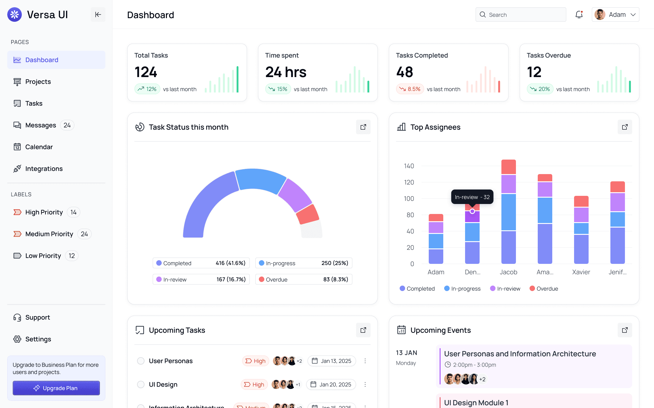
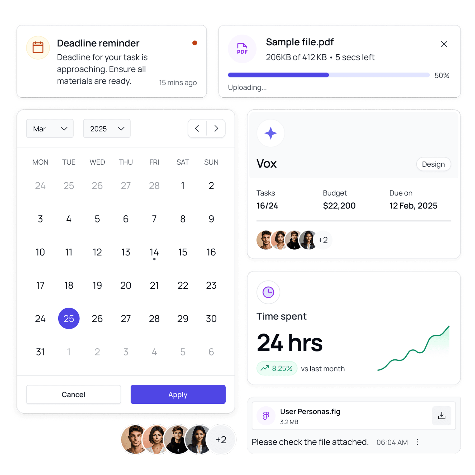
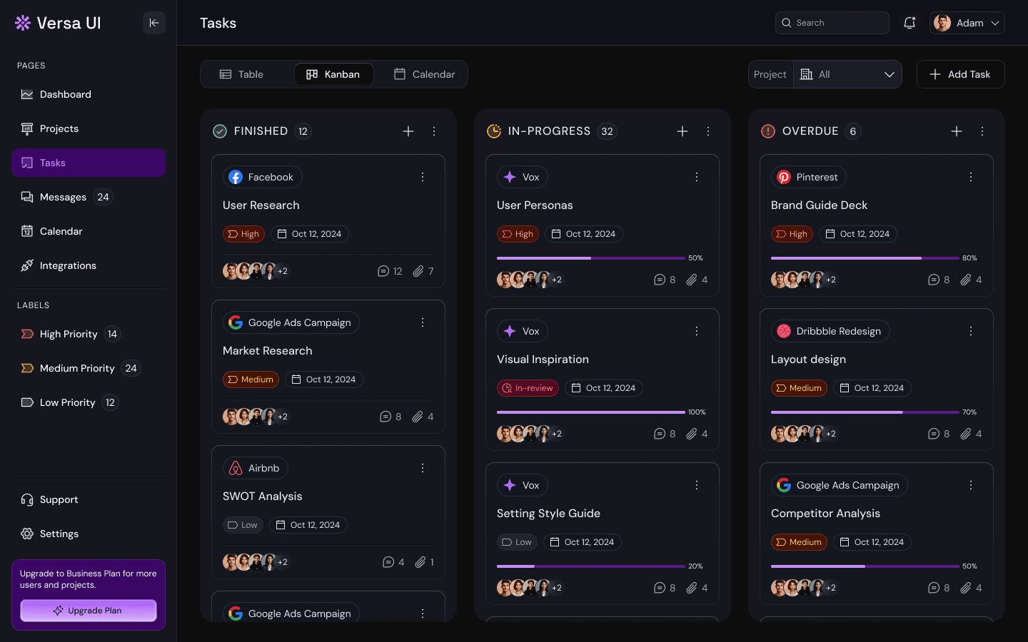
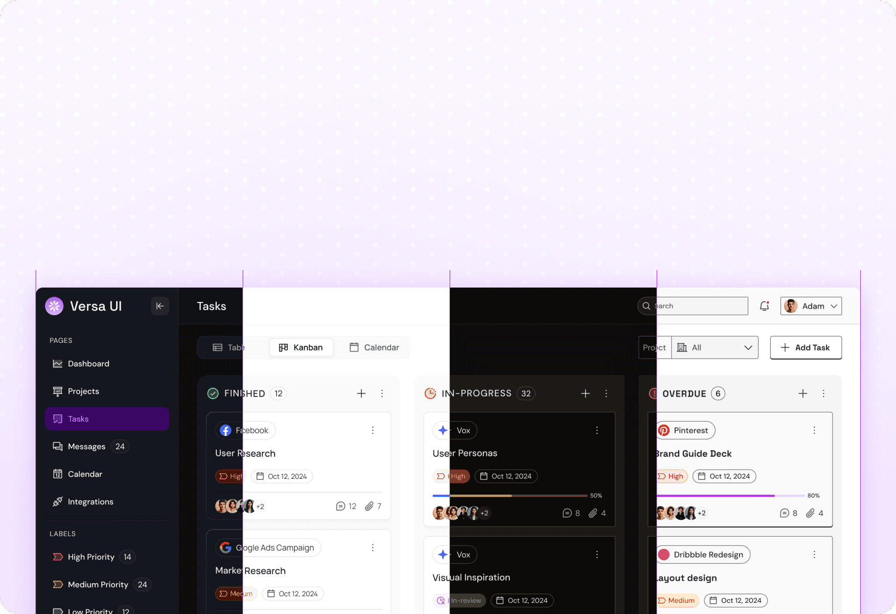
Task Management Web App
Manage projects, track tasks, schedule events, and collaborate effortlessly with a full set of clean, modern screens.
Real Estate Website
Beautifully structured pages for real estate platforms covering listings, agent profiles, maps, blogs and more
Task Management Web App
Real Estate Website
Task Management Web App
Manage projects, track tasks, schedule events, and collaborate effortlessly with a full set of clean, modern screens.
Real Estate Website
Beautifully structured pages for real estate platforms covering listings, agent profiles, maps, blogs and more
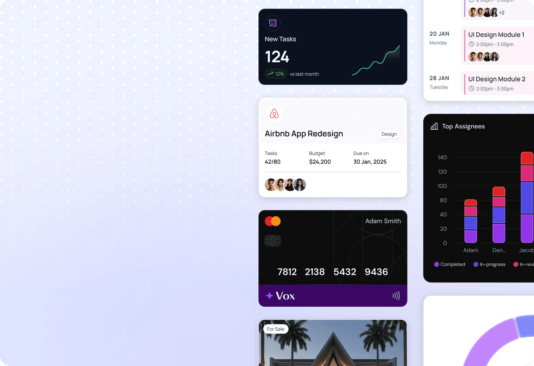
1600+ Components
From form fields, buttons and dropdowns to calendars, charts, tables, chat messages and more.
1600+ Components
From form fields, buttons and dropdowns to calendars, charts, tables, chat messages and more.
1600+ Components
From form fields, buttons and dropdowns to calendars, charts, tables, chat messages and more.
4 Themes × 2 Modes
Instantly switch between Core, Glassmorphism, Neo Brutalism, and Elegant — all in light & dark modes.
4 Themes × 2 Modes
Instantly switch between Core, Glassmorphism, Neo Brutalism, and Elegant — all in light & dark modes.
4 Themes × 2 Modes
Instantly switch between Core, Glassmorphism, Neo Brutalism, and Elegant — all in light & dark modes.

9072+ Icons
Phosphor icon library with 6 weights, theme-mapped with variables.
9072+ Icons
Phosphor icon library with 6 weights, theme-mapped with variables.
9072+ Icons
Phosphor icon library with 6 weights, theme-mapped with variables.

300+ Smart Tokens
Typography, color, spacing, corner radius and elevation variables.
300+ Smart Tokens
Typography, color, spacing, corner radius and elevation variables.
300+ Smart Tokens
Typography, color, spacing, corner radius and elevation variables.

60+ Pages
Ready made UI flows to kickstart your builds.
60+ Pages
Ready made UI flows to kickstart your builds.
60+ Pages
Ready made UI flows to kickstart your builds.
FAQs
FAQs
How many themes and modes are included?
How many themes and modes are included?
How many themes and modes are included?
Can I apply my brand colors and fonts?
Can I apply my brand colors and fonts?
Can I apply my brand colors and fonts?
What kind of components are included?
What kind of components are included?
What kind of components are included?
Are there any pre-built flows or layouts?
Are there any pre-built flows or layouts?
Are there any pre-built flows or layouts?
Can I switch themes without breaking layout?
Can I switch themes without breaking layout?
Can I switch themes without breaking layout?
Can I use Versa UI for multiple client projects?
Can I use Versa UI for multiple client projects?
Can I use Versa UI for multiple client projects?
Can I use it in a team library?
Can I use it in a team library?
Can I use it in a team library?
Is it developer-ready?
Is it developer-ready?
Is it developer-ready?

Scale Smarter. Design Faster.
Ship Confidently.
Get access to a theme-flexible, production-grade design system trusted by creators, designers, and builders.
Scale Smarter. Design Faster.
Ship Confidently.
Get access to a theme-flexible, production-grade design system trusted by creators, designers, and builders.
Scale Smarter. Design Faster.
Ship Confidently.
Get access to a theme-flexible, production-grade design system trusted by creators, designers, and builders.
A versatile, multi-theme design system for Figma
Versa UI © 2025 | All Rights Reserved
Project by Kushal Jain
A versatile, multi-theme design system for Figma
Versa UI © 2025 | All Rights Reserved
Project by Kushal Jain
A versatile, multi-theme design system for Figma
Versa UI © 2025 | All Rights Reserved
Project by Kushal Jain